
The Fine Art of Creating an Impactful Brand Palette
/
Without a doubt, color is one of the most powerful and effective tools for communication. It has the ability to express thoughts without words and elicit emotions that leave lasting impressions. Because of the strong reactions that color can evoke, the right color palette is one of the most important considerations for a business to identify their brand, along with typography, graphic elements, and imagery.
Did you know people connect with color before any other graphic element? Color is registered by the brain before either images or typography, according to a study by Loyola University Maryland. This same study found that color can increase brand recognition–logo design, for example–by up to 80%. In another study, researchers found that up to 90% of snap judgments made about products are based on color alone, depending on the product.
Color psychology suggests that colors can have a wide range of effects evoking particular moods and emotions. It's often used to draw attention in advertising. Think about the brands that use orange in their marketing. Do brands like Nike, Home Depot, Nickelodeon, Etsy and Payless all make you think energetic, friendly, affordability and value?
Remove the Guesswork when Creating a Color Palette for a Brand
It's easy to get overwhelmed with all of your options when it comes to creating a color palette for your brand. These are the first questions and top priorities to keep in mind in order to make creating a color palette a much easier task by getting to the core of your brand:
What’s the Brand Mission?
Who is your consumer?
How can color tell the story you’re trying to convey?
How do you make color choices that stand out from competitors? If you’re targeting a global audience, keep in mind the cultural context your color palette will be viewed in.
First and foremost, you want to create a palette that represents the brand accurately while appealing to its target audience. Whether you’re designing a logo, a poster, or product packaging, taking the time to consider what the competition is doing will help in your color choices and can set you apart. Remember to focus on the brand story.
Sometimes we get lucky and choose colors instinctively that work, but the most effective color goes beyond personal preference. A lot of times there is a reason behind your color choices whether you realize it or not. Color theory can help you understand which colors might work well together and why.
Knowing what effect different color combinations will create within your design is an important factor. Utilizing color harmonies such as complementary, analogous, triadic and tetradic will create palettes that are pleasing to the eye. Adding tints, tones and shades to a hue can allow you to create different desired effects, such as calmer, quieter colors like pastels or less saturated and intense hues. Monochromatic, one of the more popular color schemes, is where each color is a tint, tone, or shade of a single hue. Using this type of color scheme can result in an organized and uniform feel. It's all about exploring your options and thinking these details through before settling on a certain color palette.
Color Exploration
This is the fun part! Before you dive into choosing colors, gather inspiration and create a mood board. This can include images, type, and materials–anything that evokes a style or concept that conveys the brand essence. This will also be helpful when creating other brand elements. Then, start exploring various color harmonies for your color palette. I use the Adobe Capture CC app to quickly capture color themes on my phone that I can save to my Creative Cloud library. Adobe Color CC is another useful tool. Adobe Color CC allows you to explore different color harmonies and has a library of preexisting color themes you can use and edit to make your own.
Choose four to six colors to represent your brand in various ways. As you explore, you can narrow down and refine your color palette. Showing the entire proposed color palette applied to various applications allows you to see how the colors work together. Clearly communicating color choices will show how colors play a role in the brand’s visual identity and also how you’ve thought holistically about the color system.
After you have a solid understanding of color theory and creating color harmonies don’t be afraid to experiment and mix things up. There is no ideal set of colors and many successful campaigns have broken away from the conventional. Like the great Pablo Picasso said, “Learn the rules like a pro, so you can break them like an artist.” The Ocasio-Cortez campaign is a great example of how an unconventional color palette was used to create energy and optimism. The yellow creates warmth and evokes inspiration. Yellow is often associated with encouragement. The combination of warm and cool colors creates balance within the design, and when paired together the complementary yellow and purple create a great intensity.
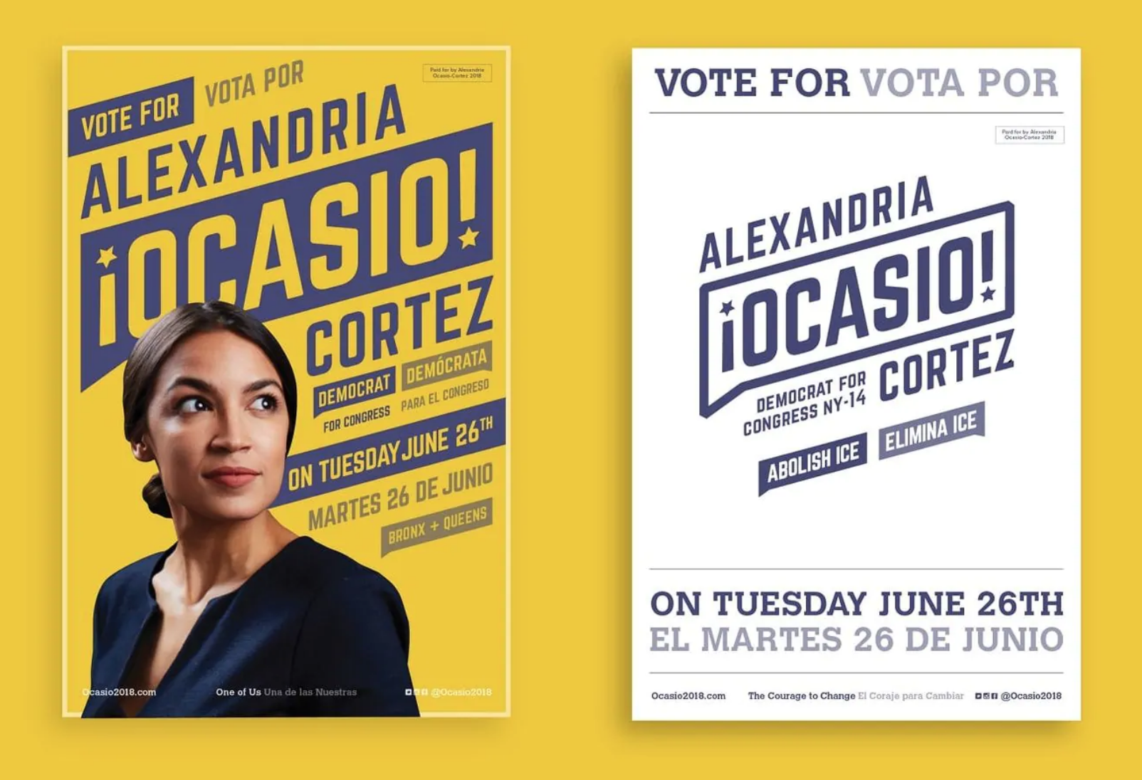
Image: Tandem NYC
Another example of color palette mastery is Wes Anderson, a favorite director of mine whose films can be easily be identified by his unique style. Color is an integral part of his process, which is evident in his choice of color palettes. However, it is only a part of his cinematic process. Concept, typography, hierarchy, form, and composition all play an important role in his stories. Color palettes must work together with all brand elements to create a cohesive brand story.

Image: Focus Features
Our Work
Our team was tasked with creating collateral for the American Advertising Federation Addy Awards. I wanted to create a color palette that was modern, futuristic and a little unconventional that aligned with our concept-The Story Unfolds. Celebrating the story of advertising and it's lasting history built upon creativity and human connection and embracing the future of collaboration. I started by creating a peach and purple gradient in tandem with a blue monochromatic gradient. These tinted gradients were used as backgrounds for all collateral. Using gradient backgrounds and the combination of blended colors created a unique and modern aesthetic. They also helped shift focus by leading the viewer through the design and allowed for the main graphic elements to really pop out. A combination of warm and cool colors are evenly dispersed throughout the design creating a balance between the rich colors used for the graphic elements. Both analogous and complementary color harmonies conveyed a futuristic look and modern color palette throughout the design.
Finding the right choice of colors is an art that can be tricky because everyone interprets colors differently. Remember the key to a successful color palette is understanding your brand story and staying true to it. Your job is to balance the complex roles that color plays in creating effective, attractive design and to represent your brand accurately while appealing to your target audience, therefore building clear communication through the impact of color.


Image: Water Street
Finding the right choice of colors is an art that can be tricky because everyone interprets colors differently. Remember the key to a successful color palette is understanding your brand story and staying true to it. Your job is to balance the complex roles that color plays in creating effective, attractive design and to represent your brand accurately while appealing to your target audience, therefore building clear communication through the impact of color.